There are many reasons why you should brand your intranet . As an application that people will interact with on a daily basis, not only does it need to work seamlessly, it needs to look good doing it. The main intent of this post is to identify the various levels of effort needed to create a visually unique master page (the global template containing reusable elements) across a SharePoint site.
Most of the principles outlined below relate to customising “Classic” SharePoint sites, and we understand that customising master pages is an upcoming feature with “Modern” SharePoint sites, therefore the same ideas should apply in future.
Levels of branding
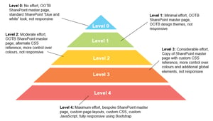
At Core, we’ve identified five levels of branding SharePoint. The diagram below provides a breakdown of effort which produces varying degrees of output.

Level 0
This is stock standard SharePoint where no customisation is done to the interface or its web parts. At most, the default SharePoint logo in the top left corner can be replaced. The advantage of keeping it “out-of-the-box” (OOTB) is that all default functionality is guaranteed to render as intended where no additional customisation is needed.
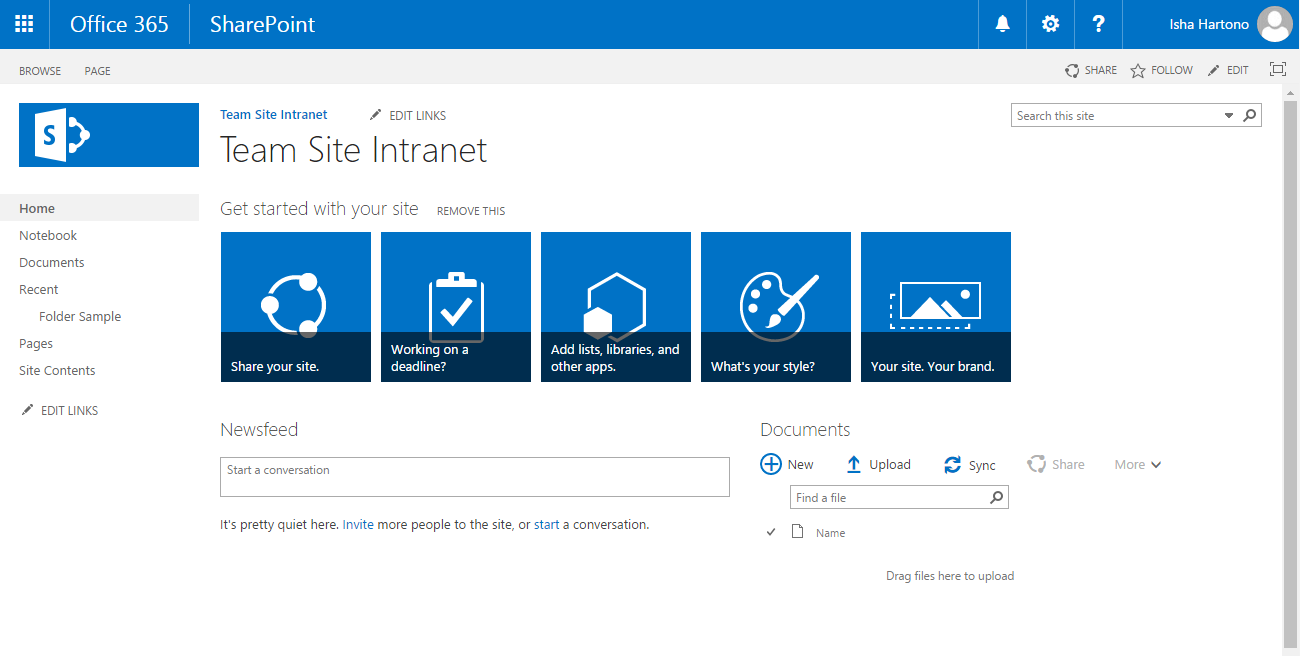
OOTB master pages are not responsive by design, i.e., the layout does not adapt to the device that it is being viewed on. Adding web parts to a page that extends the width of the screen device forces a horizontal scrollbar to appear. This is due to the contents of a web part being of a table-based layout that is fixed width.
By default, SharePoint has a feature called Mobile Browser View. This enables users to view lists and libraries (i.e., Apps) from a mobile device. However, this is done through browser detection, which redirects devices to another page whose look cannot be modified.
Level 1
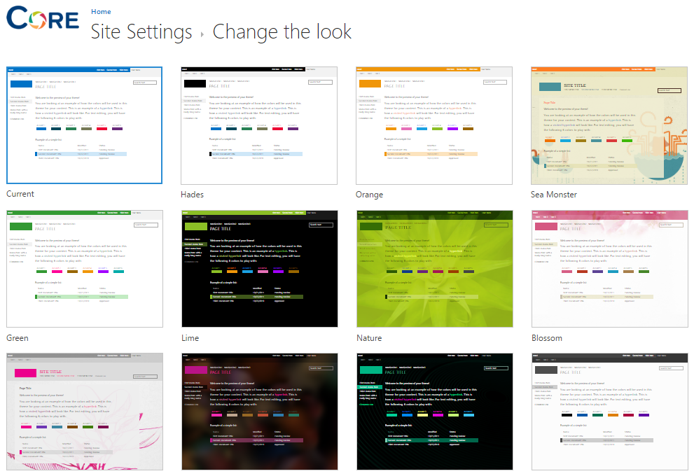
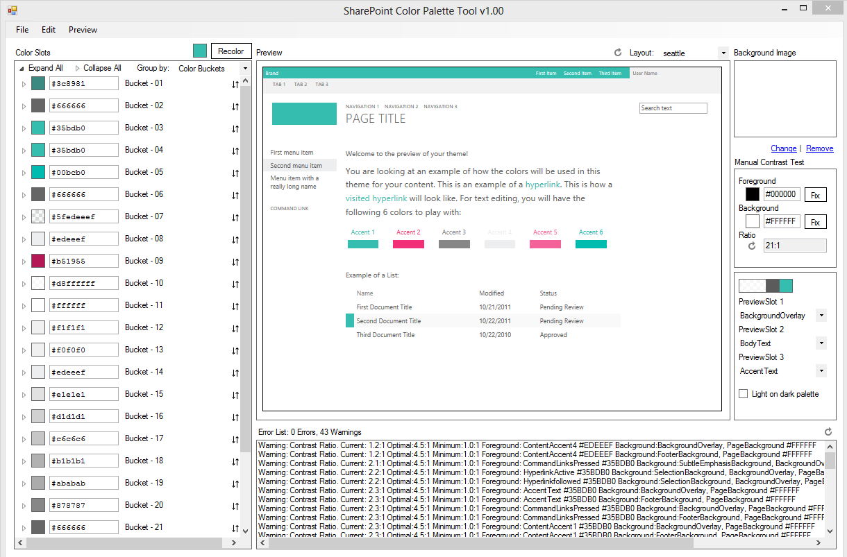
Still considered a “no code” option, elements of applying custom colours are applied using OOTB themes (Change the look) and extending those theme colours through the SharePoint Color Palette tool.
SharePoint has approximately 19 distinctive themes to choose from (the first 12 are shown below). The aim is to choose a theme that resembled your corporate identity. Selecting a theme provides the initial foundation to extend it by modifying typography, hyperlink colours and accents using the SharePoint Color Palette tool. Using this tool, a different combination of colours can be created against as set of pre-defined elements. However, as they are predefined, this option is limited to the elements that are changeable.
Level 2
SharePoint provides the ability to reference a custom CSS file from its user interface without needing to modify the master page through code – commonly known as Alternate CSS. This level uses a similar branding technique to the one before it, but the added advantage of using a custom stylesheet allows for a more flexibility by “attacking” specific HTML elements rendered on the page.
Applying a custom stylesheet not only produces unique typography, button and hyperlink elements, but allows some control in the placement of elements. However, because an OOTB master page is being used to create the “skeleton” of the user interface, it still adheres to the same rigid rules as the previous levels, even if a custom CSS is being used.

Level 3
This level is an intermediate bridge between using an OOTB master page and a fully-customised one. The idea is that OOTB master page is replicated and extend it by adding elements like additional content place-holders regions or references to multiple stylesheet and JavaScript files. Doing so allows for further control and an even more customised output while still working within the “rules” of SharePoint to ensure compatibility with native and custom developed web parts. As it adheres to the HTML structure of the OOTB master page, it is not a fully responsive-design solution.
Level 4
This approach does away with SharePoint OOTB master pages and replaces it with a fully-customised solution with custom page layouts, stylesheets, JavaScript files, and bespoke web parts. Our proprietary front-end framework integrates the Bootstrap Responsive Design Framework with SharePoint’s code base, enabling these elements to render and function well on screen based on screen size.
It is important to note that responsive design is not merely a case of “squeezing” content into a smaller screen, but also prioritising what information is displayed. The more requirements needed to display mobile or tablet content, the more custom development may be needed to achieve this. Our range of quick start intranet templates allow us to give us the initial foundation to create bespoke designed intranets, rapidly.
One process which cannot always be easily streamlined, however, is visual design since this is quite a unique to customers. The amount of effort varies from selecting one of our “quick-start” templates to a range of conceptual design according to your business needs. Though wireframes are produced for key pages of the intranet, these are merely blueprints of functional elements. Visual design concepts create an actual representation of how these elements will actually look on a desktop, tablet or mobile environment.
What to do?
Each one of these levels has its pros and cons depending on your business needs. For example, a workflow-centric project will not need the same level of branding as an intranet designed to communicate key organisation information to wider staff. The more effort placed on an application’s user interface and user experience, the more time is needed.
If you’d like to hear more about customising your SharePoint UI and how to brand your intranet, you can contact us here.
