If you use Delve in Office 365, you might have noticed a new link on the left hand side labelled Analytics. This new feature - Delve Analytics- is being rolled out across Microsoft Office 365.
So, what is it? When you click on the link, the first thing you see is a set of metrics, giving you information about how long you spend in meetings, doing email, working after hours, and so on, in the previous week. The charts and statistics presented allow you to get insight into your own behaviour and identify issues in your personal time management.

These statistics are based on your email and calendar settings. So in the week shown here, I had 13 hours of meetings scheduled in my calendar. The measure for focus hours is around having blocks of time at least two hours long that aren’t interrupted by meetings. You can go in and set goals for these settings and scroll back week by week to see how you measured against those goals.
Scrolling down the page, there is more detail about the people you worked most with, how long you spent with them and what percentage of their emails you read:
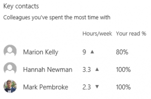
This is contrasted with information about contacts you haven’t connected with for a while, which could give you a nice little reminder to follow up with colleagues where you’ve let things lapse.
There are also statistics on your management relationship. Delve Analytics gives you statistics on things like how many meetings you had together, how much of that time was one-on-one, how long it takes you to respond to each other.
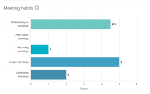
The further you get down into the page, the more detail you get on your behaviour. I can look at the graph below and get called out on the fact that I was responding to emails when I was in a meeting (that’s what the multitasking bar represents) but at least I didn’t have any meetings outside of business hours on this week.
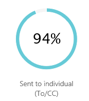
I can see that 94% of people I send emails to read them:
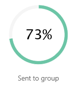
But that I only read 73% of emails that are sent to a group (here my habit of leaving emails marked as unread if I still have to action them may be working against my stats):
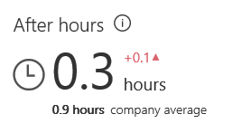
I can track how my after hours activity compares against the rest of the company:
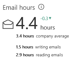
Or see how my time in email is spent:
The depth of information that is gathered by Delve Analytics is both interesting and slightly scary. Still, there are limits to Big Brother’s power. It might think you’ve had a lovely long block of focus time because there are no meetings in your diary, but it doesn’t factor in phone calls or IM interruptions or colleagues coming over to your desk with a quick question. I’d be rather concerned if it did.
It is interesting to look at these statistics and scroll back week by week and see how your numbers change. What it doesn’t do however is let you compare these figures over a longer period. I can see this week’s stats, last week’s, the week before and so on, but I can’t see the figures side by side. I can’t graph my amount of after hours time to see whether it’s increasing or decreasing, I can’t look at a chart of how much time I spend in email to see if there’s a trend. I think it would be much more useful if I could see over a longer time period so I’ll keep my fingers crossed and hope that Microsoft release an update with those features.
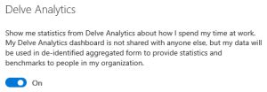
If you’re concerned by the thought of all this information being calculated about your behaviour, there is an option to opt out in your settings:
If you want more information on Delve Analytics, or any of Core's services, please contact us.


